
Choosing colors
In this section, we’re going to talk about color: how to define colors and how to check and make sure that colors look pleasing and readable even to people who have various forms of colorblindness.
We’ve so far just show how to select colors with keywords such as black and white. This can get you a long way because there are a ton of colors predefined in CSS. Check out the official description of CSS by the W3C for a big table of them.
But what if you want to use colors that don’t have predefined keywords for them? What if you want something that’s a little different, a little more uniquely you. To do that, you’re going to need to describe colors exactly: and there’s two ways to do that.
The first is by writing rgb(red,green,blue) in your CSS code, where instead of red, green, and blue you’ll want a number between 0 and 255. The color black is the same as rgb(0,0,0) and white is the same as rgb(255,255,255).
The other way you can define color is with hex codes. With a hex code you’re writing a number in base-16, also called hexadecimal, which is a way of writing numbers using 0 through F as the digits where A=10, B=11, C=12, D=13, E=14, and F=15. This counting is convenient because you can represent any number between 0 and 255 as two hexadecimal digits: 00 is 0 and FF is 255. You can double check this yourself: FF = 15*16 + 15 = 240 + 15 = 255.
So now, every color can be written as six hex digits: for example white is #FFFFFF and a bright pure blue is #0000FF. You need to put the # in front to tell the computer that it should be reading a hex number and not a normal decimal one. It might feel weird at first, but this ends up being a really convenient way to describe colors once you get used to it.
There are several really good websites that let you figure out what colors you want and tell you the hexcode. My favorite for this is color-hex. It’s a site that lets you explore and play around with various colors and even gives you convenient examples of the same color made brighter, darker, or with a slightly different tint.
Color preference is a very personal aesthetic thing. I don’t believe in the modern tech “all that exists ins white, black, and small amounts of rose gold” style that has gotten ubiquitous over the past decade.
But! There’s something we need to be very careful of when we make our sites: accessibility!
A few percent of the world’s population are colorblind. That’s millions and millions of people, all told, who see color differently than the rest of the population.
If we want to make our site usable for everyone, we need to check if the difference between background and text is distinct enough to still be readable no matter how someone processes colors. Thankfully, there are really nice tools to help you do this like the contrast checker!
On this site, you can input two different colors and find out how distinguishable they are using various tests of accessibility.
So, for example, I really love dark, greyish, teal colors like #364E4A so I want to use this color as my background. I also like having the text on my site be hdark, like just standard solid black. To me, these colors look nice and readable!

I don’t have any kind of colorblindness, though, and I should check to see what the contrast checker says.
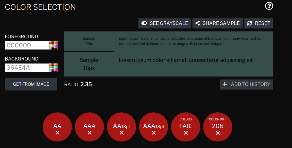
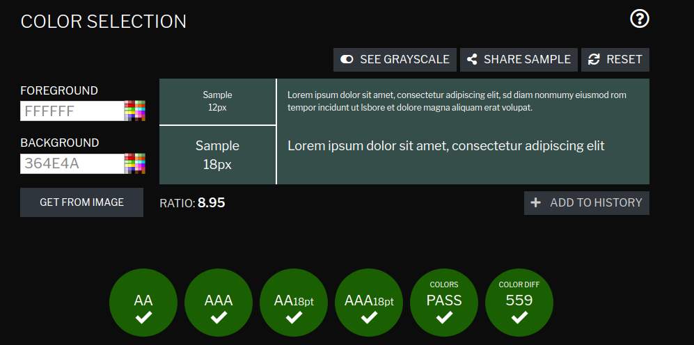
My choice fails every test! Every test! If we instead make our foreground text white then things look a lot better.
So now I’ll update the CSS in my site to:
body {
  color: white;
  font-family: Verdana;
  background-color: #364E4A;
}
And now my site looks like

So we’ve learned a bit about color and accessibility, but the layout of the site still is stuck in the late ’90s. So in the next section we’ll be able to start playing around with the shape of the site using CSS’s grid system.